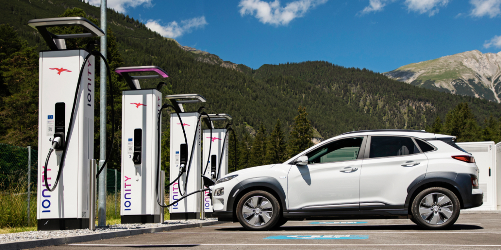
Idag klev jag och JuristeN in på WIPO utan att veta om att det är organisationens 40-årsdag. Tydligen är det också 10-årsjubileum för World Intellectual Property Day.
Jag hittade ett exemplar av WIPO magazine där det står lite om hur WIPO startades, hur det har utvecklats om lite om dagens utmaningar. Tydligen startades allting under en fem veckor lång konferens i självaste riksdagshuset i Sverige! Det var där man skrev konventionen. Man vill även belysa att WIPO finns där publiken finns, alltså på YouTube. WIPO har tydligen en egen kanal där man publicerar dokumentärer och intervjuer med artister, kreatörer och uppfinnare som ska ge IP ett ansikte.
Idag för 10 år sedan beslutade man även att den 26 april skulle vara World Intellectual Property Day. I slutet av artikeln ”Innvation – Linking the world” stå det
WIPO is dedicated to ensuring that the intelllectual property system continues to serve its most fundamental purpose of encouraging innovation and creativity; and that the benefits of the system are accessible to all – helping bring the world closer.
INNOVATION – Linking the world
Dessa dagar firar man med att lansera en ny logotyp för WIPO. Nedan finns logotyperna som WIPO använde sig av tidigare.


Såhär skriver WIPO magazine om WIPOs nya logotyp
The new logo reflects the Organization’s dynamism and innovative spirit, and is a powerful symbol of WIPO’s revitalization and strategic reorientation. It is based on a graphic representation of the WIPO headquarters’ building, an iconic structure familiar to all WIPO member states and stakeholders. The color blue links the Organization with the United Nations. The seven curved lines represent the seven elements of IP, as set out in the WIPO Convention:
* literary, artistic and scientific works,
* performances of performing artists, phonograms, and broadcasts,
* inventions in all fields of human endeavor,
* scientific discoveries,
* industrial designs,
* trademarks, service marks, and commercial names and designations,
* protection against unfair competition, and all other rights resulting from intellectual activity in the industrial, scientific, literary or artistic fields.The gathering sweep of the curves is inclusive – WIPO is an open forum, welcoming all stakeholders and points of view. The dynamic, upward pitch of the curves represents ideas, movement, and the progress which comes from innovation and creativity. This rests on a strong foundation, the name and acronym of the Organization, representing its long-standing role at the center of international IP policy. The logo’s clean modern lines reflect the trust, reliability and efficiency which are key to WIPO’s corporate image.


#1 av Rasmus, april 26, 2010 - 15:52
Föregångaren till Wipo är alltså ”Bernbyrån” eller Birpi som etablerades 1893 och flyttade till Genèver 1960.
För övrigt insisterar jag på att det åtminstone på svenska måste skrivas ”Wipo”, inte ”WIPO”. Typiskt rättighetsfundamentalister att insistera på att alltid skrivas med versaler
.-= Rasmus´s last blog ..Filmbolag kräver kollektiv bestraffning =-.
#2 av Rasmus, april 26, 2010 - 15:58
Genève menade jag förstås. Genever är en spritsort utan schweizisk koppling såvitt jag vet.
Förresten undrar jag om ILO i Genève har något med rättighetsfrågorna att göra nuförtiden. Vet du?
.-= Rasmus´s last blog ..Filmbolag kräver kollektiv bestraffning =-.
#3 av Terobi, april 26, 2010 - 16:05
Ähh. Jag gillar att skriva med versaler, oavsett organisation
När det kommer till ILO har jag faktiskt ingen aning. Jag kan inte se dem närvarande här iaf.
#4 av Björn Odlund, april 26, 2010 - 18:15
Jag tycker det självklart att WIPO skrivas med versaler då det är en akronym. Akronymer är coola.
Coolast är rekursiva akronymer. Man kanske kunde göra WIPO till en rekursiv akronym? WIPO isn’t a Property Organization, kanske? ;-D
.-= Björn Odlund´s last blog ..Röstat i primärvalet till valsedeln i Västra Götalands regionen =-.